Semantic automation is better automation
Summary #
- Easily made assumptions about the DOM leads to fragile UI tests in evolving projects, especially when you focus on the wrong attributes.
- Semantic HTML and accessibility improve automated testing reliability. Try to focus more on design intent than implementation details.
- Testing tools should leverage meaningful, programmatic page information, since it needs to be there anyway.
On shifting sands #
In traditional web development, those concerned with UI testing and automation often assume that the DOM is a reliable, static, and predictable API. You might be getting away with that assumption when maintaining software that’s not under active development. On more active projects, you’re often furiously raising tickets with your development team because your end-to-end test suite is breaking twice a day.
A critical misunderstanding often leads to countless automations, plugins, and tests that are far more fragile and less maintainable than they need to be.
The foundational concepts for improving UI automation testing focus not on implementation details, but on the design’s purpose, the implementation’s semantics and accessibility, and understanding the grain of the software you’re working with. I hope to illustrate this broadly through the lens of three tools.
Examples of robust web automation concepts #
But first, some key concepts before we look at those tools.
Semantic means meaning. What does ‘meaning’ mean in the context of web development, exactly? Let’s look at a typical web page and the DOM that underlies it.
This is the main dashboard page of the connectivity platform, Tailscale. Squint your eyes and have a glance about it. What visual constructs can you identify on this page?
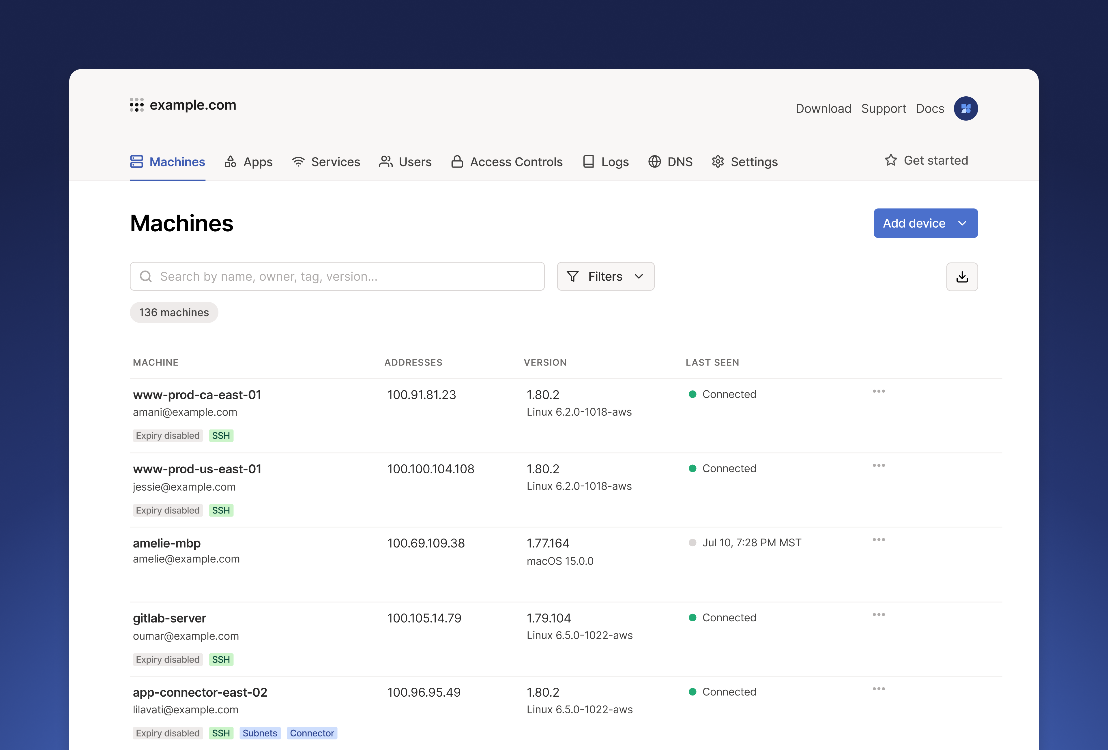
Web conventions and constructs like lists, cards, buttons, and links identify themselves as we study a page. They all have distinct, ingrained affordances that visually convey their purpose. In good design, these affordances are hard to miss but also, ideally, so obvious they’re almost invisible.
- Headings, signifying the next section of a page, distinguish themselves from other body and secondary copy by being large, bold text with spacing that relates them more to the content they title than the preceding content of other sections.
- A table/list, as a concept, is just a group of related data or content of the same type. Visually, the content of a list is usually separated by a line, a box, a middle dot (·), or a comma. A table is a more structured list, arranged in a grid.
- Tags categorize objects using short, colored, glanceable labels to communicate status or groupings.
- A card/tile/section separates areas of a page, using heading levels to title them, contrasting backgrounds, bounding borders, drop shadows, background images, and spacing to separate the objects they represent, or the content within, from the surrounding content.
- Inputs receive user content. They use borders or backgrounds, placeholders, and adjacent labels to signal where text or user selections/choices go.
- A link is underlined, usually in blue, and has a location-based name indicating where it leads, occasionally including an icon to distinguish external locations.
- A button appears in various ways and with graduated levels of visual prominence, but it always looks clickable and has an action-based label or intuitive icon.
This wealth of purposeful visual information is conveyed to the sighted user to help them parse and use the page’s content and features.
Example 1 - Landmarks #
An equivalent information-rich experience for an assistive technology user depends on the effective use of the underlying semantic markup elements and appropriate attributes that HTML offers. This is how we programmatically communicate the page’s semantic structure to non-visual users. A simplified version of the above screen might look something like the following:
<!-- The navigation for the page -->
<nav>
  <a href="/machines">Machines</a>
  ...
</nav>

<!-- The region containing the dominant content of the page -->
<main>
  <h1>Machines</h1> <!-- A top level heading -->

  <p>
    Manage the devices connected to your tailnet
    <a href="/learn-more">Learn more</a> <!-- A link! -->
  </p>

  <button aria-expanded="false" aria-haspopup="true">Add Device</button>

  <!-- The search field -->
  <input aria-label="Search" type="search" placeholder="Search by name..."  />

  <table>
 <tr>
     <th>...</th> <!-- The table headings -->
 </tr>
    <tr>
     <td>
       www-prod-ca-east-01
       <span>ssh</span> <!-- The tag -->
     </td>
     ...
    </tr>
    ...
  </table>

  <h2>Add devices to your network</h2> <!-- A second level heading -->

  <ul> <!-- An unordered list -->
    <li><a href="/add-linux">Linux</a></li> <!-- A list item with a link -->
    ...
  </ul>
</main>
However, applying this base level of information above is only the shallowest consideration needed to deliver an equivalent experience. The design’s intention extends to higher layers of complexity, and other types of visual information encode meaning in our UI, such as hierarchy, size, order, color, density, or relationships/relatedness.
Example 2 - Heading Hierarchy #
We should always ask ourselves how much information is appropriate, and what types of information we’re providing to a visual user that we might not even be consciously aware we’re providing. This consideration makes more sense when you’re thinking about more nuanced requirements for Assistive Technology (AT) users. For example, headings shouldn’t skip heading levels, as this is the primary way AT users experience content hierarchy:
<!-- Progress sequentially down the hierarchy (`H1` ➔ `H2` ➔ `H3`) -->
<h1>Macines</h1>

<h2>Add devices to your network</h2>

<h3>Operating Systems</h3>
Example 3 - Unique Labels #
As another example, button labels should be unique, and actions should intuitively relate to the object they act on. Sometimes DOM order or element proximity isn’t enough to reliably communicate relatedness. A button labeled “Add new” might make sense to a sighted user because of its location, but it leaves an AT user wondering, “Add new…what?”.
<h1>Conections</h1>

<!-- Aria-label: The label provided to the screen reader, has more context -->
<button aria-label="Add new connection">
 Add new <!-- The visible label relays on being next to and inline with the heading -->
</button>

<article>
  <h2>Sams Mac</h2>

  <button aria-label="Remove Sams Mac Connection">
    Remove
  <button>
</article>
Example 4 - Lists #
All visually and grammatically listed content (peer items of the same kind) should be contained within the appropriate list element.
<ul> <!-- A list of no particular order -->
  <li>Eggs</li>
  <li>Milk</li>
  ...
</ul>

<ol> <!-- A list where the order has meaning -->
  <li>Create an account</li>
  <li>Set your preferences</li>
  ...
</ol>

<dl> <!-- a list of one or more terms and their descriptions -->
  <dt>Firefox</dt>
  <dd>A free, open source, cross-platform, graphical web browser</dd>
</dl>
The position and inclusion of an item in a list often conveys information that might be useful to a user (or someone writing UI automation tests). If the list is sorted in a particular way, by most recent, for example, the 1st or nth item may be the target of interest.
Concept summary #
That should hopefully be enough to illustrate the kind of thinking that should go into developing a page. A successfully implemented design is rich in semantic meaning and uniquely identifiable programmatically accessible information. This richness exists because it must be there to make the information and actions it contains equally accessible to all users.
If this information exists but isn’t obvious to many users, why not increase its visibility by requiring the testing strategy to interact with it and reinforce it? Why not promote understanding of it and its existence by making it useful and noticeable to colleagues interested in testing or automating the products we build?
Let’s look at our first tool to help explore that available information a little more clearly. I’ll return to testing and automation soon, I promise.
Tool 1 - Screen reader #
I’ll use Apple’s VoiceOver as an example here, as it’s the one I’m most familiar with, the general concepts are applicable to other screen readers as well.
In the unique button label example above, let’s look at why that matters. One tool VoiceOver users have access to is Rotor control.
How to Navigate your iPhone or iPad with VoiceOver | Apple Support
How to Navigate your iPhone or iPad with VoiceOver | Apple Support
Source: YouTubeThe above video demonstrates the existence and experience of the underlying content, how it informed the users, how it needed to be unique to be useful (regions, update controls linking to the objects they control, table rows helping with repeated non-distinct content), and highlighted that this content is accessible to a piece of software, so it is programmatically available.
This reinforces that, for accessible websites, meaningful structural or interaction information conveyed visually through typesetting, color, layout, containment, division, and repetition (the design intention) must be represented programmatically in the DOM.
When we look at this with our testing and automation hats on, how is this also useful to us? This semantic content is unique, predictable (thanks to web standards and patterns), robust (as you can expect from an evolving product), and programmatically available, on top of being largely self-documenting.
This makes it highly applicable to automation, letting us write robust, self-documenting automation that matches design intent rather than the underlying implementation details.
Screen readers speak the language of HMTL semantics #
The DOM is a nested tree of markup elements. Each element has its own characteristic. It is important to recognize that there are separations of concerns here (styling, decoration, interaction, state etc.) and that some features are more meaningful and reliable than others.
- Elements come in many types, each with its own meaning, implied role, typical content, and standardized interactions. Some have little or no meaning.
- Attributes: some of these relate to the state of the element (does it have an explicit role, is it expanded, is it a menu list for another control, is it focusable, etc.).
- Some DOM features are purely aesthetic, so they matter much less (for example, styles and class attributes) or are irrelevant to the element’s purpose.
In real-world development, implementation details change rapidly. Under that web page bubbles a team of product owners, designers, business people, and developers. They research, redefine, refactor, rename, reuse, abstract, reorder, user-test, measure, revise, and unit-test. They encapsulate, restructure, reflow, resize, translate, and optimize. They may also insert and remove 3rd-party components and libraries from other teams who are executing the same chaos. That can leave a lot of elements and attributes to forage through.
Knowing how to pick out and use the more stable, reliable, meaningful (semantic) information for your automation requires a strategy for understanding what’s meaningful. Which pieces are most meaningful and appropriate, and likely more stable, and which are volatile, meaningless details that should be avoided?
Tool 2 - Browser Accessibility Tree Panel #
Another way to view the Document Object Model (DOM), the HTML elements that make up the page structure, is through the Accessibility Tree panel. This way is a more stripped-back or focused way that many will find less overwhelming.
The Accessibility Tree panel is in your browser’s development tools.
The content displayed here is derived from the DOM content and the accessibility API. It’s nested in a similar way to the DOM tree. Its usefulness comes from the way it filters out all information that does not relate to the page’s semantics.
Take a look at this second example page.
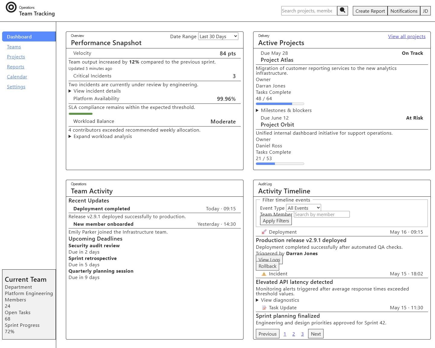
Here’s an example of the accessibility tree for the above dashboard.
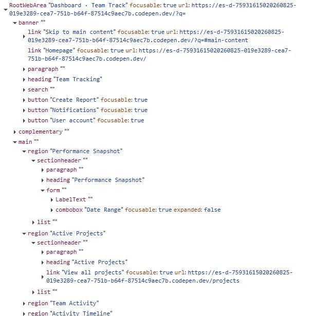
What are you seeing here? Can you see how the underlying DOM and the accessibility tree derived from it relate to the visual elements rendered on the page? I hope you find it less overwhelming than staring into the void of the equivalent DOM tree for the same page.
Each node and leaf in the tree relates to elements and their attributes in the DOM tree from the perspective of what matters for content, role, and state to an Assistive Technology (AT) device, for example, a screen reader.
Look at the page structure, and you’ll see how it maps to visible regions. A banner at the top contains the page heading, action buttons, and a hidden skip navigation link. The main region contains even more named generic regions with their own contents.
Note that each node in the accessibility tree also has some color- and format-specific information related to it, this color has useful meaning to it:
- Purple: an element’s role
- Blue: Element name/label, if it exists
- Orange: the element state, if applicable
Now we have a way to understand, explore, and validate that semantic information is present and in the correct, expected configurations. The next tool is more focused on encouraging good semantic practice and then using the requirements and predictability of that content to do powerful, robust, and useful automations.
Tool 3 - Testing Library #
The third tool I’d like to highlight is the Testing Library, a library that doesn’t focus on utilities that test implementation details. Instead, it offers utilities that encourage good, intuitive, and resilient testing and software practices. That is, testing UIs the way humans use them, facilitated by producing accessible markup we discussed before. The outcome of these tests gives a better signal when a failing test actually matters and more accurately represents broken software, not just an overly brittle test.
Comparing test maintainability with intuitiveness. Using a strategy like test IDs and regular traversal of the DOM, you might have a test or piece of automation that looks something like the following:
Give me the element with the test-id of ‘abc_block_123’ or the element at the location div > div > div > div > button > span > svg and get the aria-label of “Sign In”
await page
  .getByTestId('abc_block_123') // Give me the element with the test-id of ‘abc_block_123’
  .locator('div > div > div > div > button[aria-label="Sign In"]') // Within the element get the button
  .click();
Or in a more semantic approach, the same test could look as simple as:
// Give me the element on the page with the role of header
const header = screen.getByRole('banner');

// Within that header find an element with the role button and the name Sign In
const signInButton = within(header).getByRole('button', {
  name: 'Sign In',
});

// Click the Sign in button
await user.click(signInButton);
When tests inevitably break (a bug was fixed, a feature was removed, moved to another region on the page, or changed from a menu to a radio group), tests written this way are much easier to reason about and require less effort to maintain.
In our list example above, we need more than just the features available in the testing library.
import { within } from "@testing-library/...";

const list = screen.getByRole("list", { name: /locations/i });
const items = within(list).getAllByRole('listitem');

const thirdItem = items[2];
expect(thirdItem).toHaveTextContent("...");

const firstMatch = items.find((item) =>
  within(item).queryByRole("heading", { name: /the lourve/i}
)
expect(firstMatch).toBeDefined();
Semantic testing strategy or best practice #
What are the best practices for using Testing Library to select robust elements?
To get the most value from Testing Library, you should select your queries carefully for each case. This priority order is recommended:
getByRole('[role]')/getByRole('[role]', { name: /label/i })- Validates the existence of a role and optionally a named role, which provides high information scent when used appropriatelygetByLabelText('[input-label]')- Great for finding input elements based on their connected label. The actual labelling strategy is abstracted away as an irrrelevant implementation detail.getByText('[target-text]')- Useful to validate non-interactive contentgetByPlaceholderText('[target-placeholder-text]')- Fallback for rare labelled inputs that are exempt from having a visible label; not recommended as most inputs should have visible labels.getByDisplayValue('01/04/1990')- Retrieve an input based on its pre-filled valuegetByTestId('[page]__[region]__[element]__[state]')- Last resort; only recommended when no other role-based assessment can be made.
This priority order reinforces meaningful UI-element targeting and guides us toward more meaningful tests. I’ve seen how this approach begins to train the QA team to start asking your developers questions like “Why isn’t this element using a correct role that matches what it looks like?”, “Shouldn’t this element be inside a named region?” or “Can we make the label on this control more unique and descriptive?”.
Before you know it, you’ve accidentally improved the experience for assistive technology users, made broken tests easier to reason about and debug, and strengthened the robustness of your automated tests.